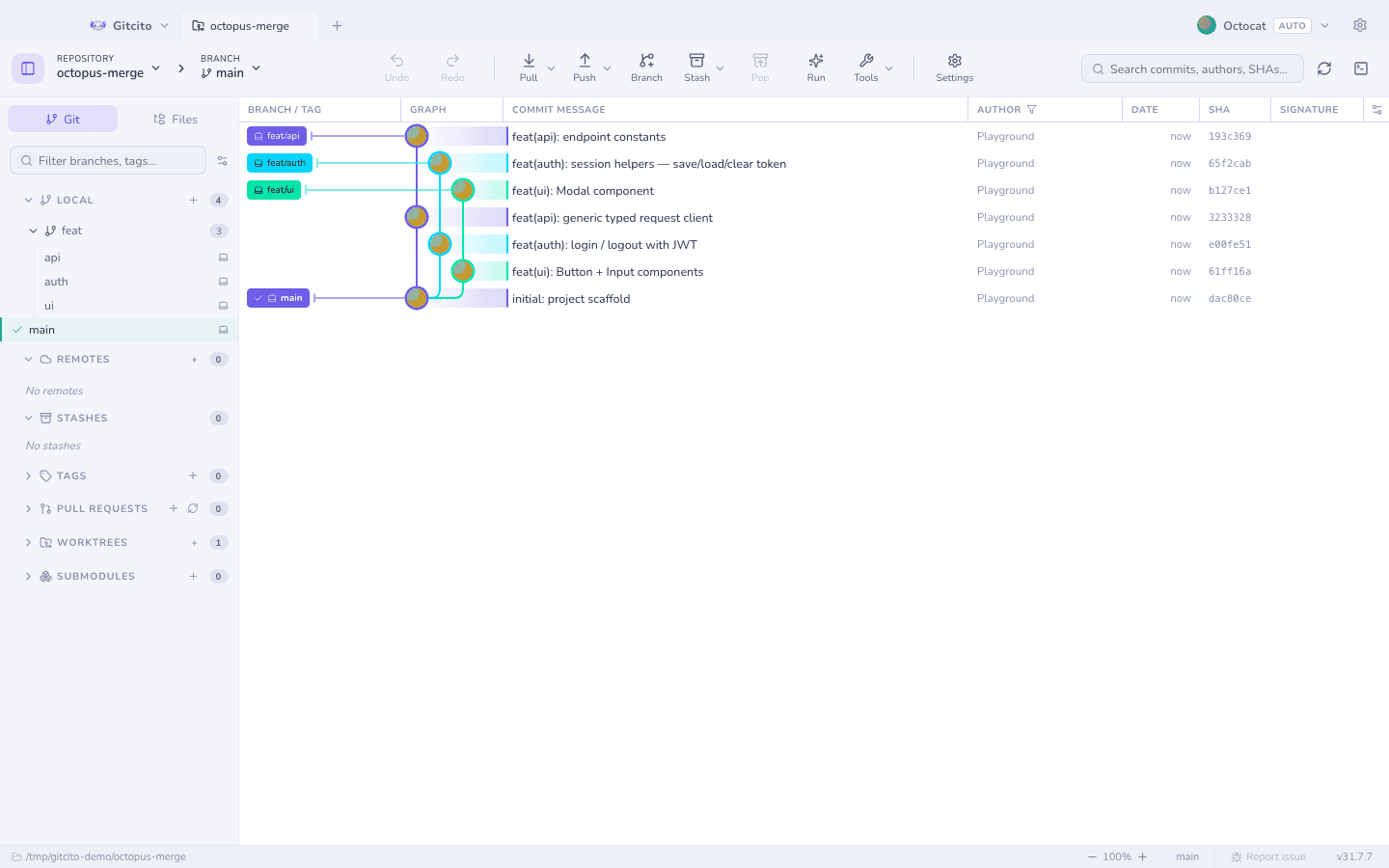
How to visualize your Git commit graph (and read it)
git log --graph tries its best with ASCII art, but the moment history has parallel branches and merge commits, text stops being readable. A visual graph turns the same data into something you can actually reason about.
01Read lanes, not lines
In a drawn graph each branch gets a lane, merges join lanes, and the shape of the history — long-lived branches, merge frequency, hotfix spikes — becomes visible at a glance.
02Use first-parent view for the big picture
A linear (first-parent) view hides the internals of merged-in branches, showing the mainline as a clean sequence of merges — the release manager's view of history.
03Navigate by search, not scroll
Jumping to a commit, branch or file beats scrolling through thousands of rows. Combine graph visualization with fuzzy search and history stops feeling like an archive.
How Gitcito does this for you
Gitcito draws branches, merges and octopus merges properly in light or dark, keeps huge histories smooth with windowed rendering, offers a one-click linear view, and lets you jump anywhere with the ⌘K palette. Lanes, colors, corners and density are all customisable.
Get Gitcito